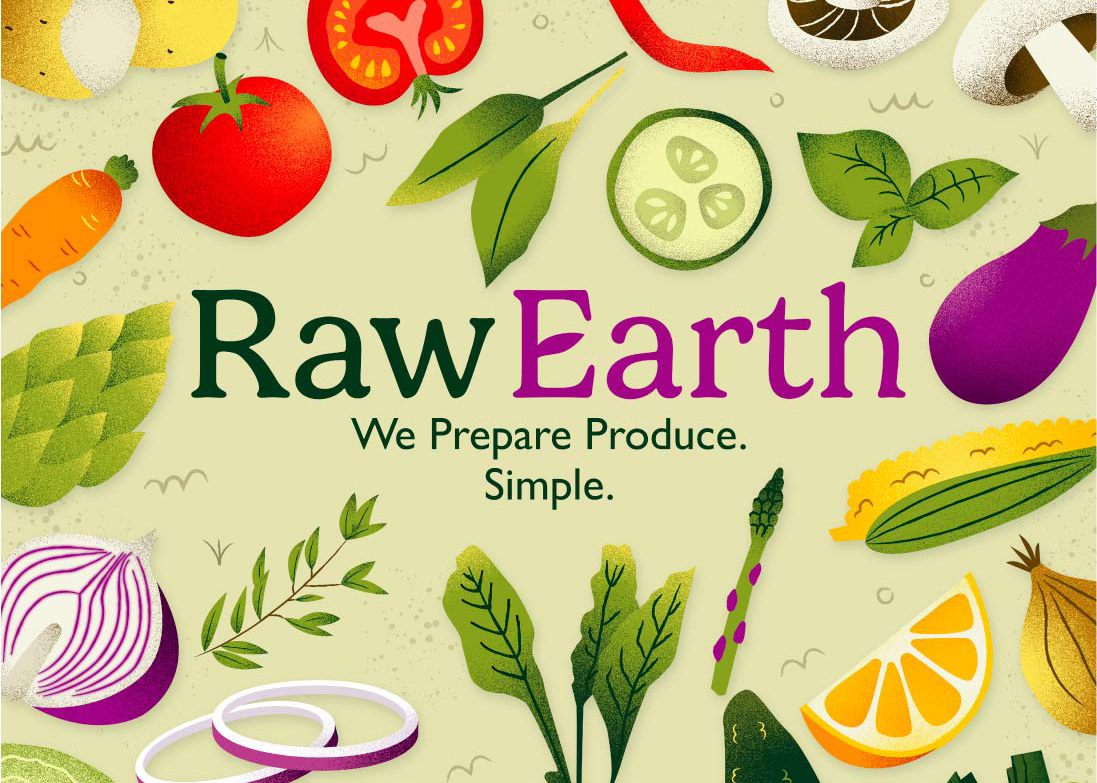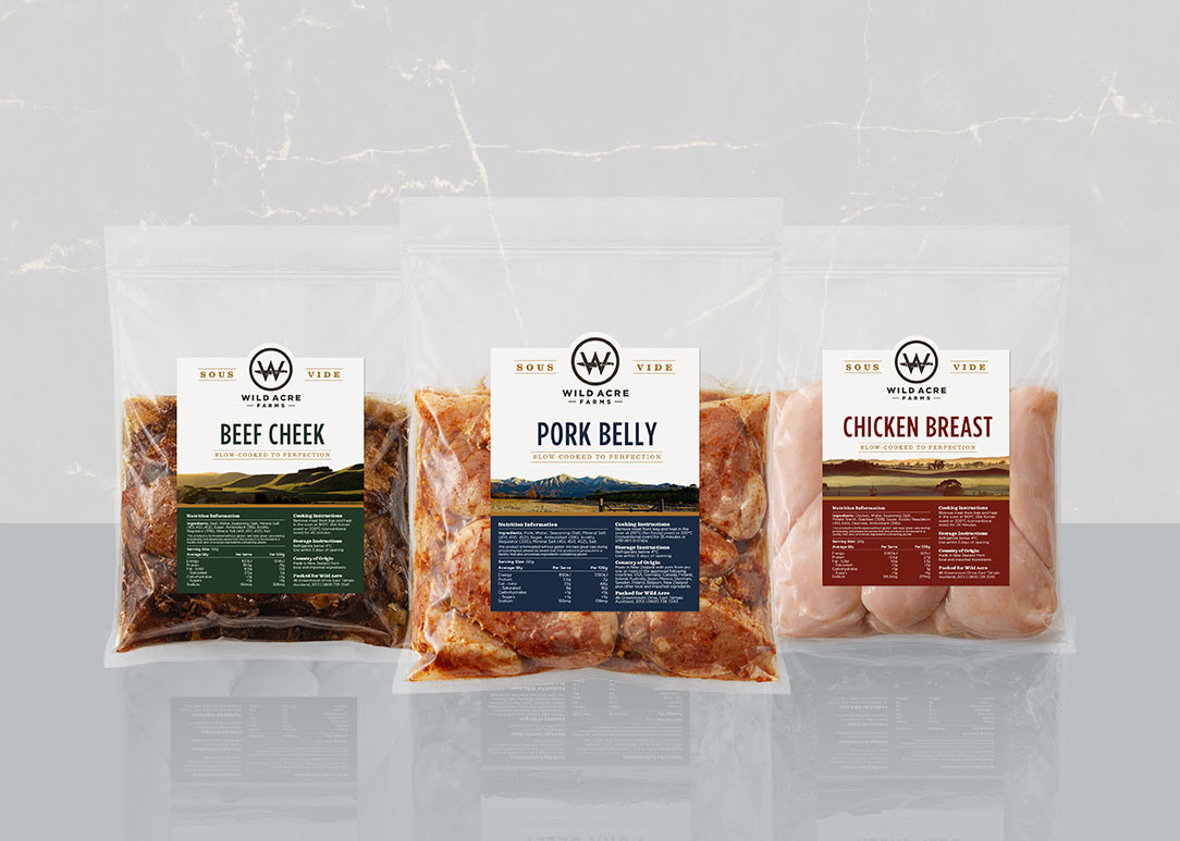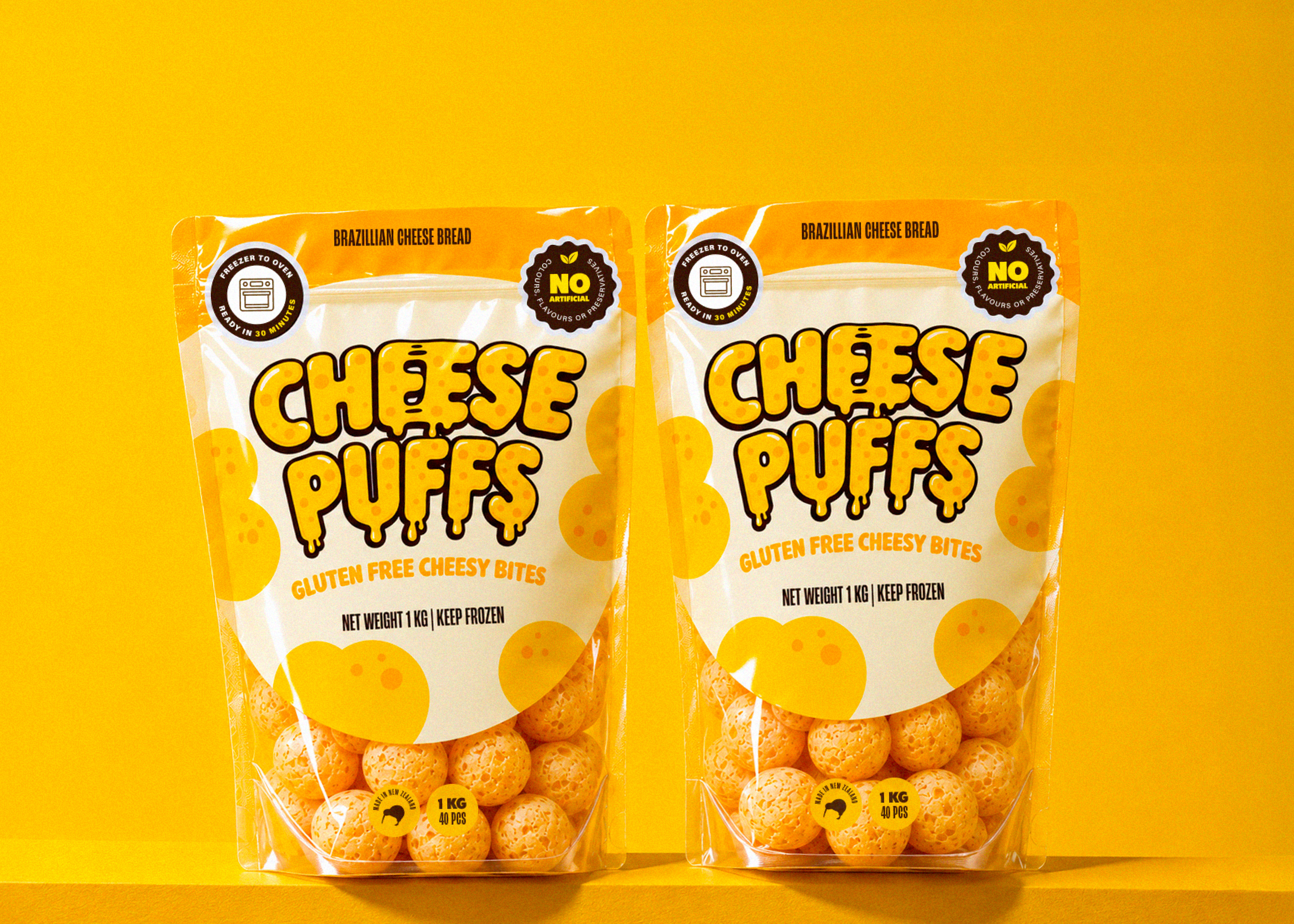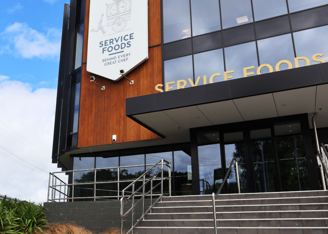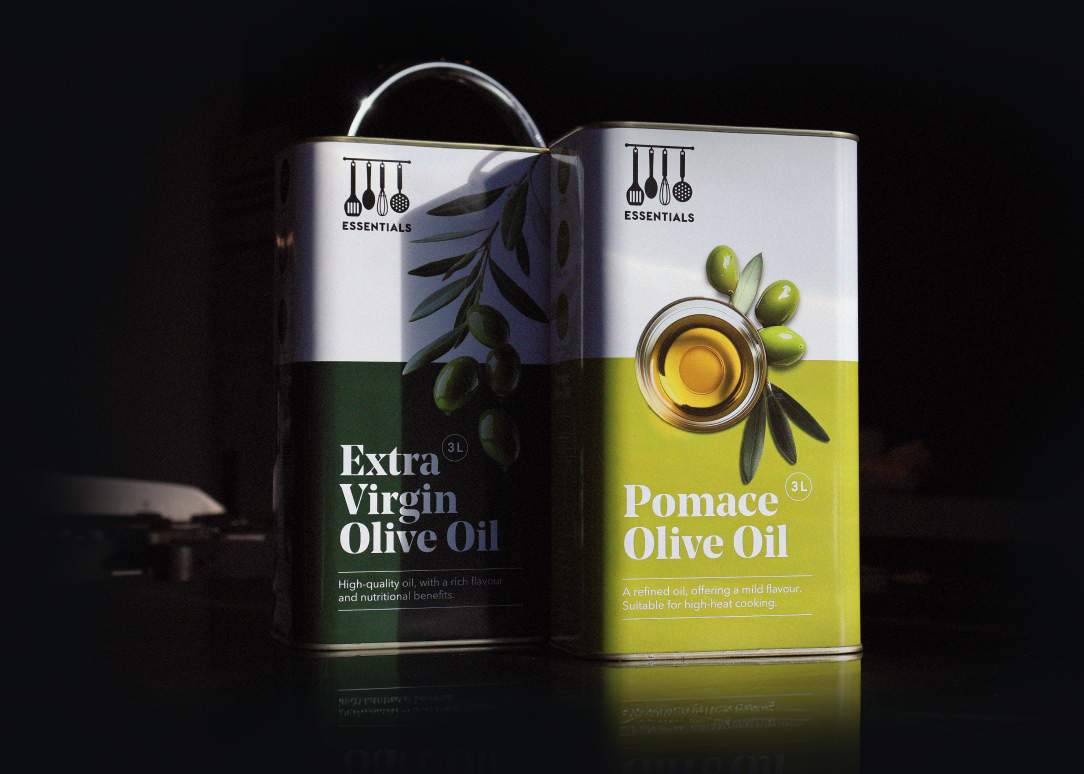
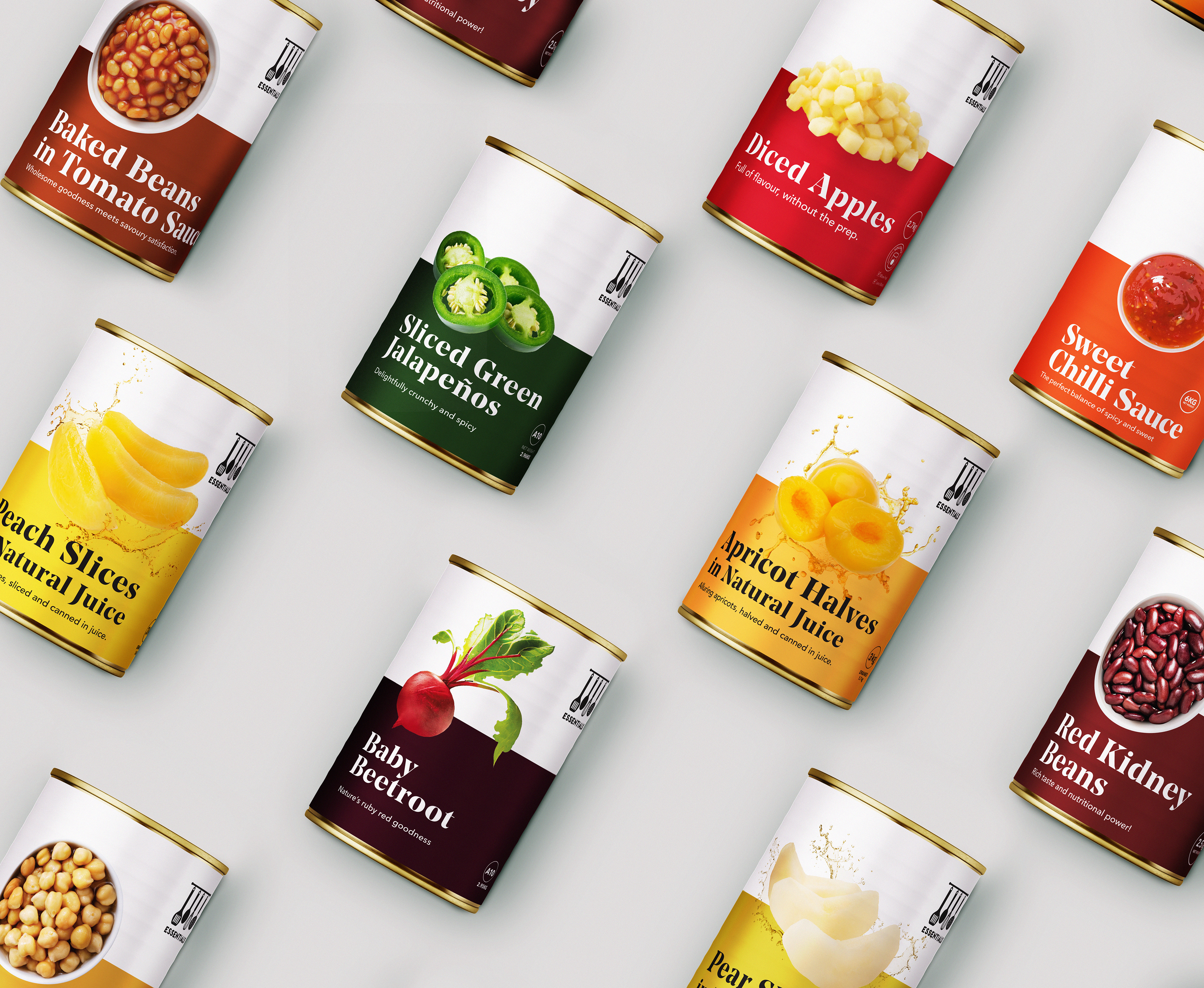
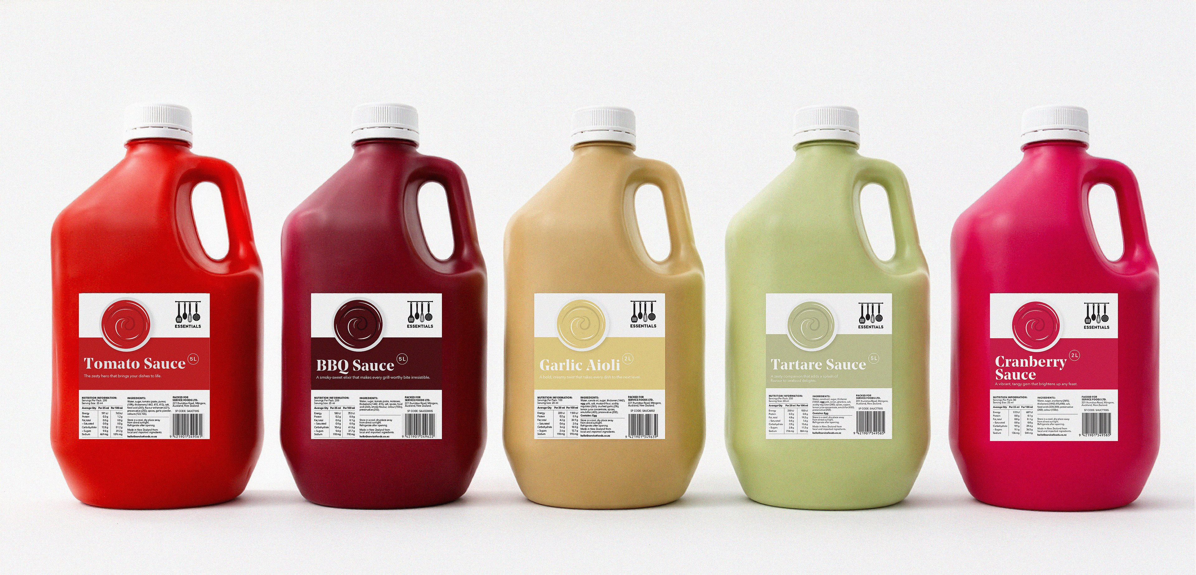
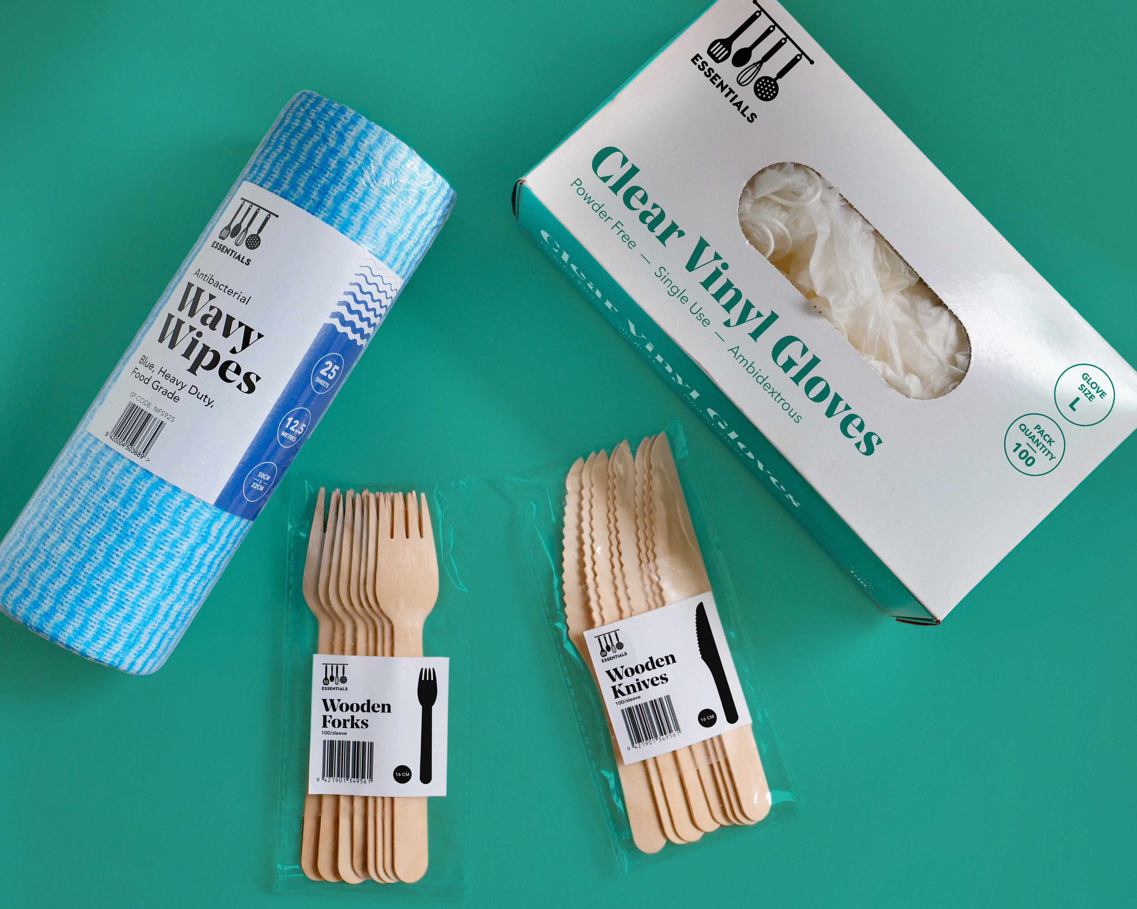
Essentials was our value brand exclusive to Service Foods. The Homebrand covered all necessities across canned food, sauces, packaging and cleaning needs all at economical prices. My responsibilities as a designer were to uphold the existing brand visuals and carry this through to packaging and marketing collateral for product launches. There were often a lot of print limitations when producing packaging. The sauce range was an example of where we had to come up with an alternative solution to photography. Simplistic swirl graphics were created instead for each sauce flavour.
Project Reflection:
There was a lot of potential for developing the brand, some ideas include:
- Creating a brand identity, tone of voice and formalising brand guidelines.
- Designing a cohesive colour palette to give direction and structure for the colours used.
- Revisiting typefaces and type hierarchy.
- Creating an illustration system and guide for labels with print limitations.
- Creating a guide for label stock imagery.
- Designing more layout variations to adapt to different label sizes.
- Expanding the Essentials Logo.
- Creating a brand identity, tone of voice and formalising brand guidelines.
- Designing a cohesive colour palette to give direction and structure for the colours used.
- Revisiting typefaces and type hierarchy.
- Creating an illustration system and guide for labels with print limitations.
- Creating a guide for label stock imagery.
- Designing more layout variations to adapt to different label sizes.
- Expanding the Essentials Logo.