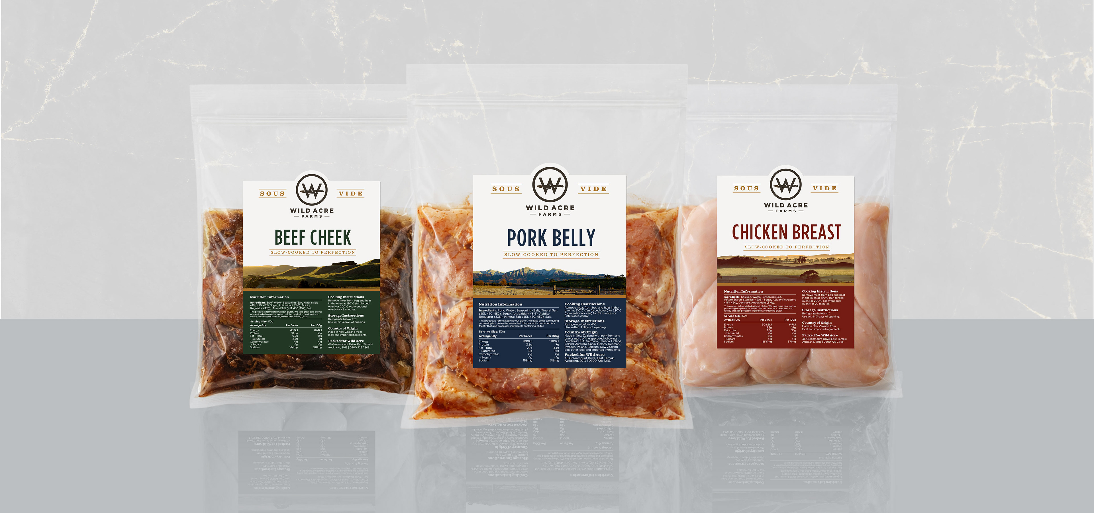
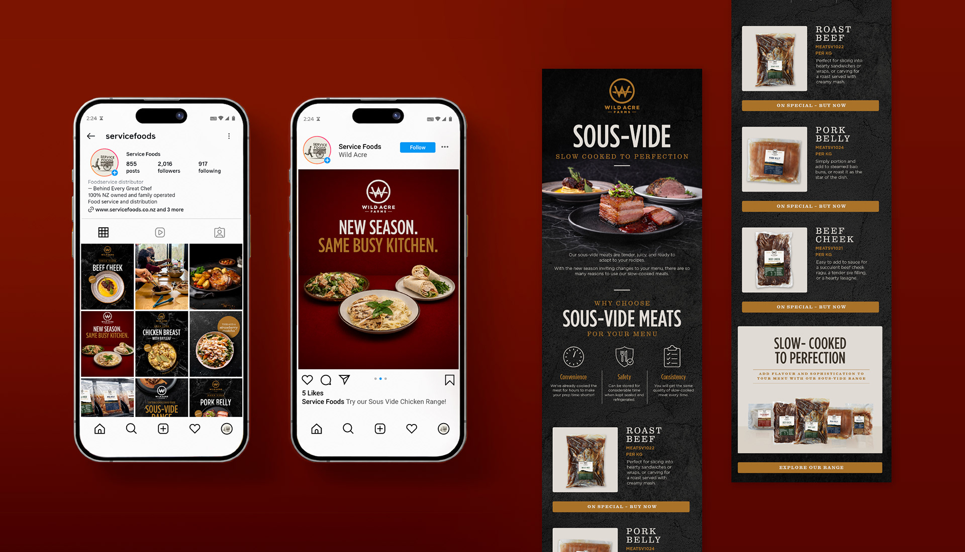
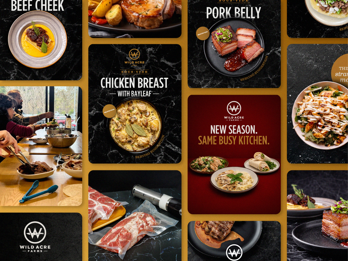
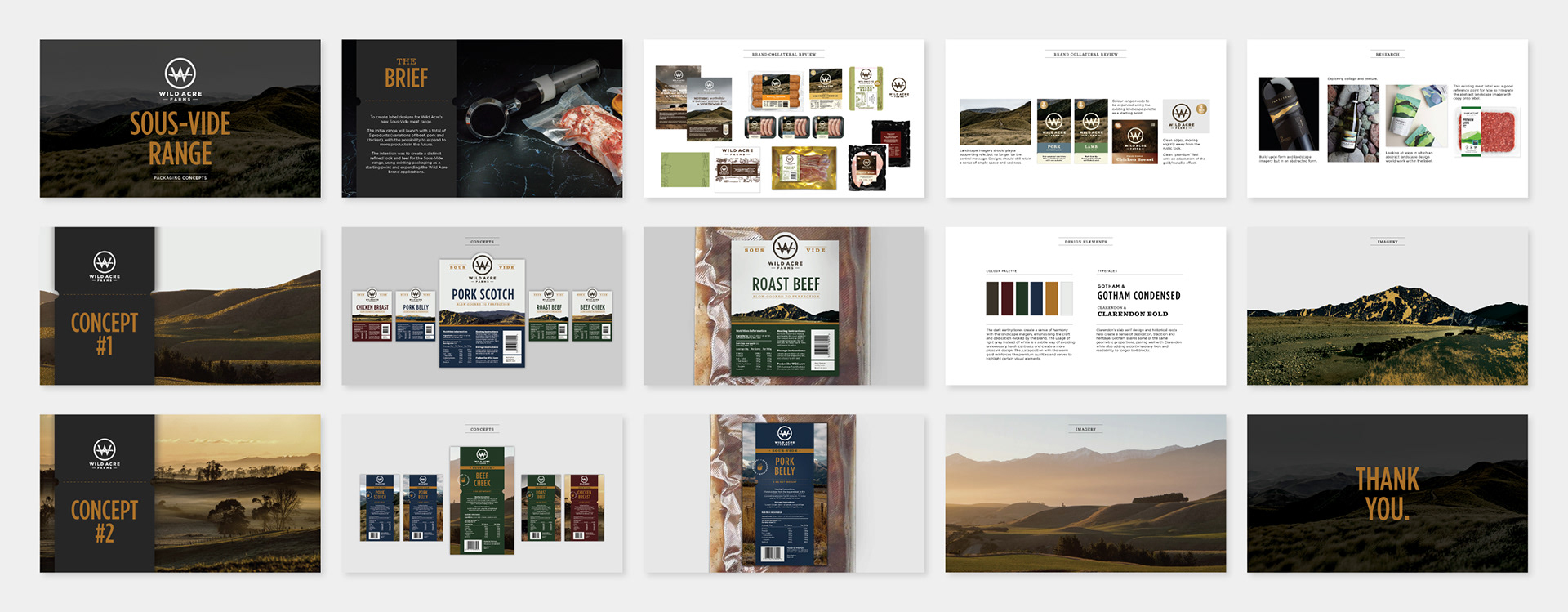
The brief was to come up with label designs for a new product range of meats for the Wild Acre brand. The direction was to create a visual identity that was distinct enough from other Wild Acre packaging as a premium product. I worked on the initial genesis of look and feel through to developing the packaging and presenting concepts. We have since rolled out marketing collateral ranging from social, web assets and EDMs as ongoing promotion for the range.
Design Strategy
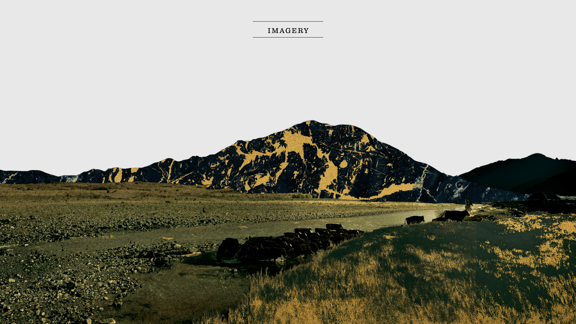
Our approach was to reposition landscape imagery as no longer being the central message. I researched into packaging examples that used abstract landscapes and experimented with a few designs. The colours used were dark earthy tones to create a sense of harmony and instil a premium feel. Gotham Condensed was introduced as a modern addition and to create point of difference.
Project Reflection Notes:
The small label format would have benefited from a more simplified design approach. Introducing a system of iconography could also help differentiate meat cuts more effectively. Additionally, I would explore a broader and more structured colour palette to cater to future expansion of the range.